At first glance, this oddly designed seems to belong in the all-too-frequent category of questionable 1970’s designs that haven’t quite held up as well as their prior decade ancestors. But look again, or, better yet, allow me to shed some light on this sports chronograph and also to photograph it in a way that supports my opening statement. Folks, it’s #TBT and in my semi-humble opinion, I think it will be a good one.
On screen, I always felt that Roamer Stingray Chrono Diver was a massive watch both in diameter and in height. I couldn’t have been more wrong about both. The other thing I’ll mention is that most sales ads fail to accurately capture everything that’s going on with this watch and the complexity. I feel funny saying this but along with some Enicars, this Roamer is probably the most creative and highest “attention to detail” piece I’ve reviewed. And the quality? Pretty darn ridiculous.
The movement found inside this Roamer Stingray Chrono Diver has a great one. If you’re a student of the game, you’ve likely noticed that the lower pusher is slightly more “off-center” than its upper counterpart. So, yes, inside beats the lovely column-wheel Valjoux 23. And it’s wonderfully smooth to wind and use. It’s also signed despite being a tough movement to uncover. So that brings up an interesting point because after only one year of production, Roamer chose to lower cost with a move to the cam-lever Valjoux 7733 as seen here. This according to “roamer-watches.info” was only made for the next 2-3 years until the model was phased out entirely. Naturally, understanding whether you’re buying a V23 or later version is important value wise. Thankfully, the pusher configuration is a dead giveaway if ample photos are given.
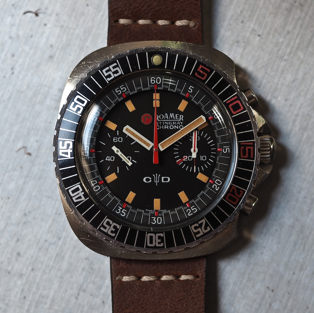
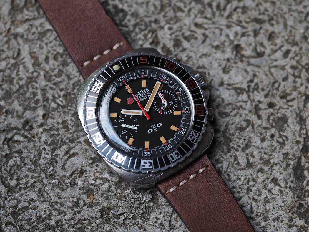
The Roamer Sting Ray Chrono Diver has a unique case, a signed crown, was equipped with a Gay Freres bracelet, but what does it look like and does it impress? Well, in brief, it looks amazing in person and, hell yes, it’s impressive. I mentioned that sales postings make the “C-D” look awfully thick and ungainly. In the metal, though, it’s phenomenally flat and while the acrylic crystal is curved around its edges, it’s basically flat and not overly thick. Oh – and in one more nod to details, it’s signed in the middle of the crystal with an “r” just like Omega and Universal Geneve did with their respective logos. Also, the dial itself is not far below the crystal.
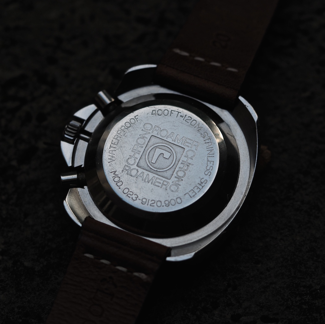
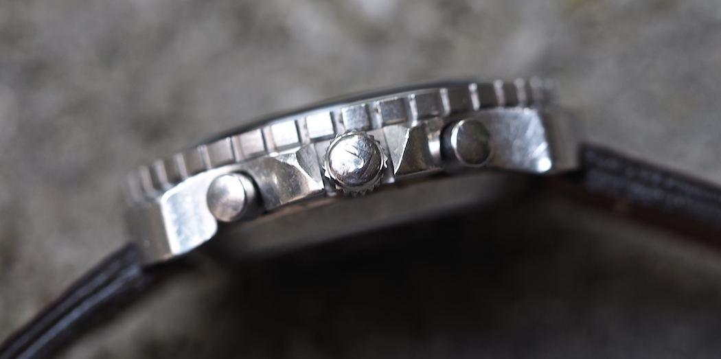
Kicking it off, the Roamer Sting Ray Chrono Diver is fully stainless steel and contains a front-loading case that measures about 42mm in diameter. Actually, consistent with other Roamers of the time, the movement pops out of the case including the caseback and crown/pushers still attached. It’s unconventional and probably your first clue that a lot of thought and, likely, investment went into the design and making of these. No, Roamer wasn’t using an also-ran case like so many of the time and while pictures of a deconstructed Chrono Diver don’t show any markings, other models of the time did use EPSA cases. Also, as this is the “Chrono Diver” model, the case back is adorned with a depth rating of 120 meters or roughly 400 feet.
Other wonders abound on the Roamer Stingray Chrono Diver such as the beautifully bold bidirectional bezel that’s outfitted with the first 20 minutes in red font. It’s unique, bold, but not cartoonish. The red carries over on the applied Roamer logo, hashes found on the inner bezel, the “candy cane striped” minutes register hand, the Roamer trademark red slash at 20 minutes on the sub register, and the sharp centrally mounted chronograph seconds hand. This is all contrasted against a matte black dial and white font and hands. The writing on the dial – the offset brand name and the “C-D” with trident makes highly creative use of the dead space on the dial and while this originally offended my sense of symmetry, it actually fits the brashness of the case design.
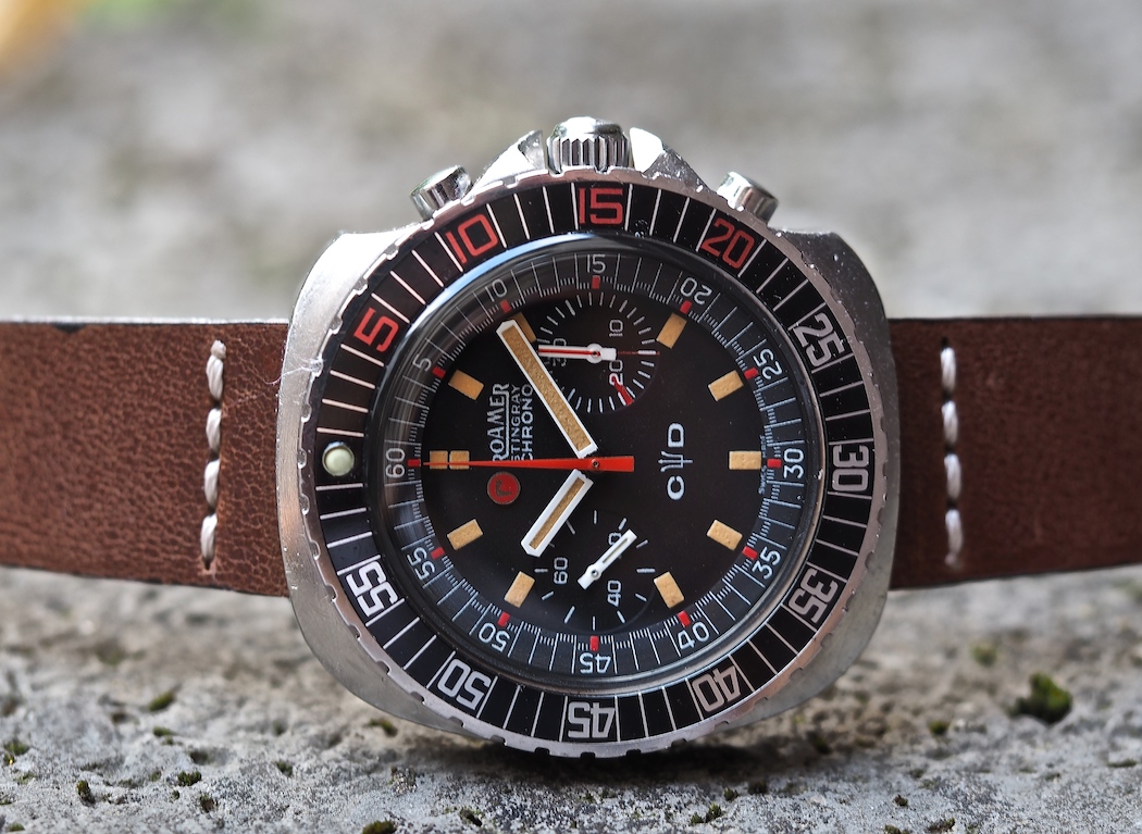
A parting glance at this chronograph would assign it to being just another goofy 1970’s c-cased chronograph made to compete with the likes of the extreme c-case purveyor, Omega. However, this watch – a year after Omega’s initial Speedmaster II – was actually introduced in 1970 and that makes it fairly progressive for the time. Also, I’d draw your attention to the shape of the case and the sheer amount of asymmetry. Left on its side, crown down, it actually does take on the shape of a stingray – or maybe more of a horseshoe crab, but they both live in the water, right? The other oceanic reference I thought of, what with the watch’s boldly notched bezel and severely pointed crown guards, is that of a barnacle – tough and a bit unshapely. However you’d call it, it’s very unique and the other surprise about it is that it fits so well. Coming back to the case side, the watch is outfitted with a nicely signed crown, those wild crown guards and two aptly sized pushers.